
Wednesday, June 8, 2011
Movin' on up to the East Side...we finally got our piece of the pie
After nine months of independently publishing my art reviews on this blog, I have finally made the jump and found a new home for my First Friday reviews at ereview.org. I'm very excited to be accepted as a writer for ereview, and you can continue to find my monthly reviews there shortly after every First Friday. Thank you!
Wednesday, May 11, 2011
I pity the fool that missed this opening...you gotta grow up sometime...wow. Um, for real? Ok...the mad scientist from another dimension...you know, like the Jonas brothers or the Lawrence brothers, but not lame...we need a safari, not a stroll through the park
This month’s First Friday festivities were unusual in that they were completely dominated by a single show. Don’t ask me how, but for one night on May 6, Kansas City was selected as the first of three cities to be transformed into a nexus of contemporary creative culture by the traveling show entitled “America:Now and Here.” The show features over 150 artists, filmmakers, poets, musicians, and playwrights in a daring attempt to represent a broad, cross-sectional sampling of the best that American culture has to offer, ranging from Sting to Philip Glass, to RobertRauschenberg, to Cindy Sherman, to Edward Albee, to Joan Baez. And yes, even Leonard Nimoy is included. I had never known Nimoy in any capacity beyond his role as Dr. Spock on the original Star Trek series until I saw his name next to a black and white photo of several overweight nude women posing ala Matisse’s dancing nudes. That is exactly Kansas City needs events such as “Now and Here.” It is a show with work that is a bit more new and edgy than most First Friday shows, and as a result people unexpectedly discover all kinds of new and exciting things when exposed to it.
“Now and Here” is such a large show that it doesn’t really do justice to speak about any individual pieces. They all exist in a context with each other, which is fitting because the show is intended to, and does, exist within the larger context of modern America. Like our country, it is a rough mixture of disparate components, but in some areas they are able to blend together a little more smoothly. Pieces of completely different character abut one another, and the show stretches over a massive area, but all these different pieces belong together because they are united under the same ideals. “America: Now and Here” is on view at the Leedy-Voulkos Gallery, The Base Gallery, The Beggar’s Table, Arts Incubator, The Sherry Leedy Gallery of Contemporary Art, and perhaps some other places that I didn’t get to. The show is listed as running through May 28, so be sure to make the trip down to the Crossroads before then to see what is perhaps the most ambitious First Fridays showing to date.
These pieces are visually pleasing. They possess a nostalgic quality by featuring older structures that feel like relics of the past because of the technique used to create them. The scenes are further strengthened by adding small embellishments of color and also allowing the bare wood to show through in parts, which manipulates the space to a state beyond being a straight representational image. Developing a visual style is a period that every artist must go through before moving on to developing a concept for their work. Judging from these pieces and venue they are in it is likely that the creator is still at this early stage in their career, so it would be unfair to expect anything more out of the work.
Considering the stage that the artists are working at it is an interesting show that presents many glimpses of promise, but one slightly unsettling thing about the show is how varied the experimentation is. Just judging from everything in the show one might assume that the work of as many as seven artists was being represented. The styles and subject matter of the works are all over the map, and they demonstrate at least enough technical acumen that the artists should be zeroing in on a more specific artistic identity or idea than is demonstrated.
For example, there is plenty of evidence in the work to suggest that a wood panel covered in paint and glitter is not their best work and doesn’t belong in the show. Another piece which features an abstract pattern created by a pile of cut logs. The ends of the logs face towards the viewer and create an abstract image by allowing the wood grain beneath to show through them. By itself it is not a bad piece, but in the context of the rest of their show it feels incomplete and simplistic. It is obvious that Rockwell and Morris have talent, but it is essential that they raise their own standards and learn to expect more consistency out of their own work. Otherwise they may never successfully find their way through the experimental process.
 Looking at the work of Guinotte Wise, it is easy to envision the place where he lives. It has to be somewhere out in the country where he can keep a huge selection of scrap metal to draw from. Most likely he has an old barn full of junk that could fittingly appear on the TV show American Pickers, or maybe Hoarders, in which he spends much of his time tinkering with small metal odds and ends, occasionally turning a finished piece of art out of the mess. If given the chance who would turn down an opportunity to do that every day?
What sets Wise’s work apart from others who make similar sculptures from scrap metal is the refinement of his finished product. Many artists fall victim to the appeal that the materials themselves have. They are content to create random assemblages out of old license plates and the like, turning a pile of metal scrap into a stuck-together pile of metal scrap. But Wise is beyond this. His sculptures come with a purposeful refinement, and the characters of the materials themselves act as an embellishment to the piece rather than being the main attraction.
The same completeness of vision benefits several of his abstract wall-hanging pieces. While these works are more akin to the random assemblage style of working, they are compositionally and materially very well thought out. Wise allows the materials to stand alone as unique objects that also fit into a larger purposeful composition. The end result is similar to an abstract painting that is enhanced through an added variety of space, texture, and material, which becomes far more interesting than could ever be achieved through paint alone.


 Without occupants the store and parking lot become purposeless structures, causing the viewer to consider the space as a structure and environment similar to a large-scale art installation. One might begin to wonder what it means to cover such a large expanse of land with concrete or to erect such a large, minimalistic structure of glass, concrete, and steel, and suddenly something we commonly think of as normal becomes very abnormal.
Unfortunately, Kozak’s photographs stop at the doorstep in terms of exploring the subject. All of her images show these places more or less as they would be seen from the street. Not only is this the most simplistic way of approaching the subject, but I know I’ve seen several other photographers do the exact same thing. What would make the show exponentially more interesting would be to physically explore the sites and highlight some of the details they contain. This would be more engaging for the viewer by presenting them with images of things that they ordinarily wouldn’t see on their own, and would also be more effective by exposing the latent energy and character held by abandoned sites.
 One idea might be taking a picture from the front door of the building facing toward the street. Everyone has the opportunity to see the building as it appears from the street, but not many people will ever experience the view from this vantage point. Other opportunities arise if the building has been empty long enough there might be evidence of time taking its toll on the site. Tall weeds might be growing out of cracks in the cement. Birds could take up residence in eaves and signs. Painted words and images could be peeling and fading. These are just a few ideas that could result in a more engaging collection of photographs, but the necessary element is having the desire to explore as an artist. People like to be exposed to new things through viewing and experiencing art, and Kozak must be willing to take the next step and wander off the beaten path to find something interesting and new to present in her photographs.
 |
| A photo by Andres Serrano included in "America: Now and Here." Serrano became well-known for his controversial photo "Piss Christ," which claimed to portray a crucifix in a jar of the artist's urine. |
“Now and Here” is such a large show that it doesn’t really do justice to speak about any individual pieces. They all exist in a context with each other, which is fitting because the show is intended to, and does, exist within the larger context of modern America. Like our country, it is a rough mixture of disparate components, but in some areas they are able to blend together a little more smoothly. Pieces of completely different character abut one another, and the show stretches over a massive area, but all these different pieces belong together because they are united under the same ideals. “America: Now and Here” is on view at the Leedy-Voulkos Gallery, The Base Gallery, The Beggar’s Table, Arts Incubator, The Sherry Leedy Gallery of Contemporary Art, and perhaps some other places that I didn’t get to. The show is listed as running through May 28, so be sure to make the trip down to the Crossroads before then to see what is perhaps the most ambitious First Fridays showing to date.
Jeremy Rockwell and Jeromy Morris at the Scarlett Garnet
 |
| A small glimpse at some of the work from the Rockwell-Morris show. |
It’s difficult to think of something to say about Jeremy Rockwell and Jeromy Morris’s two-person show at the Scarlett Garnet because the exhibit lacks any specific focus. Having never seen work by either artist before, I’m not even sure which pieces belong to whom. The only guide to the show is a hand-drawn diagram of the pieces on the wall with a corresponding price list, and the names “Rockwell+Morris” written on it. This presentation is not atypical of the Scarlett Garnet, but despite the informal presentation and lack of cohesiveness in the work, it was one of the more interesting shows outside of the “America: Now and Here” showings.
There are plenty of strong suits present in the works. Inventively rendered graphic images and patterning are present in several pieces. However, these stronger elements are conceptually and technically spread throughout the experimentation of two artists who are in the early stages of developing an artistic identity. The most notable pieces appear to be either screen printed or photo-transferred images of cityscapes onto wood panels. The high contrast and intricate detail present in these pieces help them stand out from the rest of the works, and by far the largest piece in the show was a roughly four by four-foot panel of a New York street scene, which was too large to hang and instead situated off to the side on the floor. 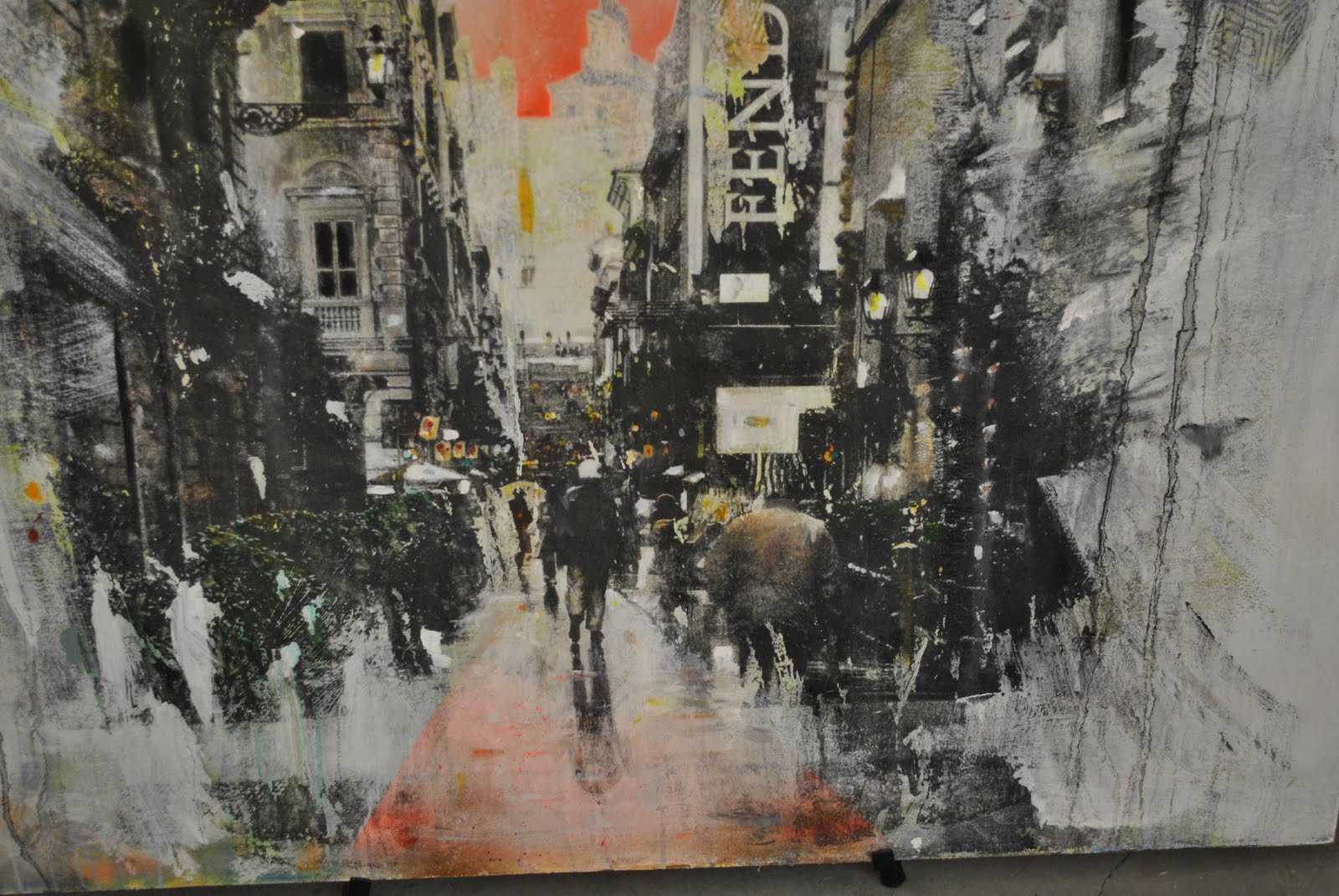 |
| A detailed look at the largest piece in the Rockwell-Morris show |
 |
| Pieces such as this one don't live up to the standards established by other pieces in the show |
For example, there is plenty of evidence in the work to suggest that a wood panel covered in paint and glitter is not their best work and doesn’t belong in the show. Another piece which features an abstract pattern created by a pile of cut logs. The ends of the logs face towards the viewer and create an abstract image by allowing the wood grain beneath to show through them. By itself it is not a bad piece, but in the context of the rest of their show it feels incomplete and simplistic. It is obvious that Rockwell and Morris have talent, but it is essential that they raise their own standards and learn to expect more consistency out of their own work. Otherwise they may never successfully find their way through the experimental process.
Steve Brisendine at Plenum Space Gallery
This is going to be a very difficult and unconventional review to write for a few reasons. One reason is that this is the first time, at least that I’m aware of, I will be writing a review about an art reviewer. Steve Brisendine is relatively well-known for his column “ArtKC 365,” which appears on the website www.ereview.org. In his column he makes a daily post about a show currently on view in the Kansas City area. His posts are usually no more than a couple hundred words and focus on describing the work and what the art is about. It might sound easy to do post something like this every day, but in reality it has to be mind-bogglingly difficult. It might only take an hour or so to write and post one of these entries, but most people lack the conviction to stick to a diet or exercise for twenty minutes a day, much less produce a new piece of writing daily. Not to mention that the pool of artists has to shrink pretty rapidly at this pace. I only review about five artists a month and it’s sometimes hard to find work by people I haven’t reviewed before. So respect.
Another thing that makes this review unconventional is that I don’t have any pictures to go with it. I aim to avoid contact with the artist when I review shows because I don’t want their additional input to skew my perception of the work itself, and if it’s a show I don’t particularly like it can be awkward trying to scrounge up some vague compliments. Photographing work at a show is a lightning rod for the artist’s attention, so I try to do it as surreptitiously as possible. Typically I just have to hang around for a moment until there are enough other viewers to distract the artist from my activity, but I was pessimistic that that opportunity would occur at Brisendine’s show.
Ascending the stairs into Plenum Space the far wall can be seen first. Then as you continue up your head begins at the floor-level and rises as you enter in the middle of the room. This entrance offers a small preview of the show before plunging you right into the middle of it, and my reaction as I made this entrance was exactly this: “Huh?...whoa.”
For his show Brisendine chose to display small canvases that were each covered in a single solid color. Besides the title, choice of color, canvas size, and in a few instances the use of a round or diamond-oriented canvas, there is no difference between any of the pieces. My initial reaction was to turn around and leave, but then I realized that the only people there were me, Brisendine, and a guest of his seated at the far end of the room. I was in too deep to cut and run, so I made my way round the room and read the titles as he watched in anticipation of my reaction. I tried to procure an explanation for the show but ended up grabbing at air. Was it serious? Was it a reaction to his feeling so self-conscious of his role as an art reviewer that he became reluctant to make his own work? Was I supposed to feel like a fool by pretending to be interested in looking at what are essentially blank canvases?
Fortunately another person entered and he began talking with them, and in overhearing his conversation I discovered that each canvas was actually a specific colored shape that had a real-life meaning to it. For example, one canvas represented the Libyan flag, which is a plain green rectangle. Several of the other pieces he mentioned also represented flags, but what got me was that he would actually call it a flag rather than a painting. They are painted canvases, not flags, and without an explanation the viewer is not going to make that connection. The format of the presentation is crucial when making such minimalistic work, and in this show there is not enough information to portray the idea that these pieces represent symbols. Rather, they are objects that lack the qualities that we have come to expect from art done on canvas. If the flag pieces were actually plain colored rectangles of fabric, then perhaps the idea of the shape as a symbol would get across. Or maybe if some of the pieces were universal icons, like a red octagon, it would occur to the viewer that the others should be thought of as symbols as well. But as it stands now, it is an extremely minimalistic showing of colored canvases. Certain that the show couldn’t retain a viewer for more than a few seconds and attract a large enough audience to conceal my photographic activities, I left without any photos. Fortunately I don’t think that photos are really necessary in describing the show.
Guinotte Wise at the Hilliard Gallery
 |
| Some scientists believe this wheeled equine animal to be a modern relative of the giant metal rockinghorse |
Since I began attending First Fridays in Kansas City, there is one piece that I’ve seen every time without fail. It is a large five to six-foot tall metal sculpture of a rocking horse. I’ve seen this shiny metal fixture on the sidewalk outside of several different galleries on the east side of the Crossroads, most often in front of the Hilliard Gallery. I came to think of the horse as an odd symbol for First Fridays. It wasn’t labeled, it was placed in spots that invited interaction despite being too awkward to truly interact with, and it had a somewhat gaudy, outsider look to it. Obviously nobody was interested in buying the thing, yet its owner placed it outside every First Friday to mark the occasion of the event. Now, finally, I think I may have discovered who made the garish creature after seeing the show by Guinotte Wise at the Hilliard Gallery.

What sets Wise’s work apart from others who make similar sculptures from scrap metal is the refinement of his finished product. Many artists fall victim to the appeal that the materials themselves have. They are content to create random assemblages out of old license plates and the like, turning a pile of metal scrap into a stuck-together pile of metal scrap. But Wise is beyond this. His sculptures come with a purposeful refinement, and the characters of the materials themselves act as an embellishment to the piece rather than being the main attraction.
Many of his pieces either contain gun elements or combine create a gun. Some of the more interesting works in Wise’s show are sci-fi inspired ray guns complete with custom display pedestals. These pieces become fascinating artifacts through the completeness of the vision and presentation, physically creating something that previously only existed in cartoons, movies, and our imaginations. The most interesting of the gun sculptures is perhaps one that stuck a typesetting drum onto the barrel of a .38 revolver. The drum appears to belong to a piece of printing machinery from the 30s or 40s, and looks like something that was smuggled out of a William S. Burroughs dream.
 |
| One of Wise's ray gun pieces |
 |
| This "gumball baby" is not the darling of this particular show |
The successful pieces of the show are all marked with a distinctly odd, quirky feel to them. They are unusual objects that don’t make a lot of sense and push the viewer’s imagination. Some of the less-successful pieces in the show are the ones that seem to gravitate towards producing a quick, easy solution out of the materials. One example of this is a piece that consists of a robot made by fixing arms and legs to a gumball machine with a baby doll’s head in the machine reservoir. As humans, we look for the human element in things, and producing anything that resembles a person is typically the first response anyone has to an object. If one hundred people were handed a gumball machine and instructed to make a sculpture out of it, I’d wager that at least eighty of them would come up with some kind of humanoid form.
Along the base of one wall were several small robots that suffer from the same problem. If the robots were incredibly large they might have the possibility of being remarkable, but instead there is nothing more to them than being a handful of patched together robots. Wise also has several animal forms on display which, while being similar in construction to the robot and humanoid pieces, manage not to appear so dull. A large part of their success relies on the fact that these iconic natural images are constructed out of man-made objects. Yes, the idea is relatively simple, but the end product is not necessarily as intuitive as it is to construct a humanoid form out of the materials.The Walker Brothers at Next Space Gallery
Once again I must tip my hat to the Next Space Gallery. One of the most unconventional galleries in the Crossroads that I’ve encountered, it is quickly becoming one of my favorite through its consistently offbeat style and presentation of work. This month the drawings of the Walker brothers (Luke, Spencer, Micah, and Austin) were displayed up in the front window of the gallery. The drawings, all done on copier paper, bear obvious style differences between the artists but all share the same energy of surrealistic portrayals of the subconscious combined with modern culture. Or in simpler terms, they are some really intricate, interesting doodles.
 |
| The Walker brothers' show as it appears from the street |
Most of the drawings are densely packed with images and marks. Some show recognizable icons like Big Bird and Mario amid a jumble of abstract imagery, with an erupting volcano in the background. Others rely on abstract patterning and mark making to create an interesting multi-dimensional mind space. The incredibly informal execution and presentation of the pieces doesn’t detract from the work at all, but actually enhances the raw talent contained in it. There are literally millions of people out in the world who make work similar to this and think of themselves as real artists but can’t make anything that’s even in the same ballpark as the Walker brothers.

Their drawings are on par with many other young emerging artists today that are gaining some success. For example, their drawings are in similar vein of the work by Brooklyn artist Ray Sohn currently on view atWonder Fair in Lawrence, but the informality and naïve energy contained in the drawings is far more interesting than the stiff, formulaic “artiness” contained in Sohn’s show. If given the proper opportunity, exposure, and direction, they could achieve a place between art world heavyweights like Michael Krueger and Tony Fitzpatrick. Their work could really turn some heads by having the possibility of the four of them working collaboratively on larger, more sophisticated projects. It is rare to find more than two artists who can work well together, and looking at these small doodles through the window panes I see a lot of potential in where it could go.

The limit of that potential is determined by the brothers themselves. Maybe they are perfectly content with their current status. Hell, I’ve scoured the Internet trying to find more information and can’t even find out who they are. I’m assuming that they are young amateur artists based on the appearance of their show, but for all I know they are already famous and working under aliases. Or maybe it is only one person working under the guise of four brothers. Who knows? This isn’t the first time I’ve been stymied trying to research someone I saw at the Next Space Gallery, and that’s another reason I’ve come to like the venue. It seems that the gallery attracts artists that are completely unknown: no websites, no press, sometimes no name accompanying the work (see my March review). This makes visiting the gallery is a unique experience. Even if you find the work on display underwhelming, in this digital age there is still a value in knowing that you are seeing something that does not exist outside of the gallery walls.

Laura Kozak at Frontspace
 |
| Kozak's photo of the Plum Tree in Lawrence, KS |
Laura Kozak’s show “re/lease” deals with a subject that is near and dear to my heart: abandoned buildings. In particular, her photographs feature empty retail spaces in strip malls and sites commonly seen lining four and six-lane avenues in suburbs across America. I began a similar photographic project last summer before once again being swept up in the funnel cloud of school, and in fact one of her photos featured the Plum Tree, an empty Chinese restaurant that I also photographed for my own project.
These scenes of abandoned commercial spaces are imbued with a haunting feel by contradicting our natural assumption regarding these sites. We automatically regard places of business as being filled with people and activity because we only go to businesses that are open, and if they lack people and activity then they aren’t going to be around long. We tend to pass by vacant spaces without paying them any attention. An empty store is of no interest to a shopper, so they don’t really register in our minds as we drive by. But when forced to consider an empty store, the viewer is presented with a surreal scene with plenty to consider. 
Unfortunately, Kozak’s photographs stop at the doorstep in terms of exploring the subject. All of her images show these places more or less as they would be seen from the street. Not only is this the most simplistic way of approaching the subject, but I know I’ve seen several other photographers do the exact same thing. What would make the show exponentially more interesting would be to physically explore the sites and highlight some of the details they contain. This would be more engaging for the viewer by presenting them with images of things that they ordinarily wouldn’t see on their own, and would also be more effective by exposing the latent energy and character held by abandoned sites.
 One idea might be taking a picture from the front door of the building facing toward the street. Everyone has the opportunity to see the building as it appears from the street, but not many people will ever experience the view from this vantage point. Other opportunities arise if the building has been empty long enough there might be evidence of time taking its toll on the site. Tall weeds might be growing out of cracks in the cement. Birds could take up residence in eaves and signs. Painted words and images could be peeling and fading. These are just a few ideas that could result in a more engaging collection of photographs, but the necessary element is having the desire to explore as an artist. People like to be exposed to new things through viewing and experiencing art, and Kozak must be willing to take the next step and wander off the beaten path to find something interesting and new to present in her photographs.
 Tuesday, April 5, 2011
Islamic inspiration at the Belger...finding a Scarlett Garnet in the rough...why don't you take a picture? It'll last longer...previews of great expectations?...if it ain't metal then it ain't no good
It looks like the warm weather is here to stay, and so are the crowds at First Fridays, sometimes to a detriment. It’s encouraging to see so many people make their way out for the event after months of desolate streets and mostly-empty galleries seen throughout the winter, but in some cases the crowds were so thick it kept me from seeing the art. At the Leedy-Voulkos the north room had new work up, but the lights were turned out and hundreds of people were packed into the space to see a man playing the electric violin. Fun, but not what I’m after.
What I also found exciting about April 1st is that it was the first day of my new job. It’s refreshing to break out of a rut that I’ve been stuck in for several years at the same job and have work that I can put some soul into again, but it’s still in the restaurant business and as a result I was dog-tired before I even started my several mile hike around the Crossroads. I really had to work hard to bring the same energy to this month’s column, and I hope you appreciate it!
Sanam Emami and Sarah Gross at the Belger Arts Center
 |
| Sarah Gross's piece titled "Bowl" |
One of the current shows at the Belger Arts Center, Arabesques, features the work of sculptor Sarah Gross and ceramicist Sanam Emami who share the trait of using Islamic culture as an inspiration in their work. The show’s statement reveals that both artists have been working in the Midwest for several years and makes no explicit claim that either of them has any direct connection to Islam, so I can only assume that they are both outsiders to the culture. This has the potential to create problems in the work. For someone to observe and take interest in a culture they are not a member of, there is the inherent risk of mischaracterizing the culture, such as improperly portraying elements or imagery from it, or at the very least creating a shallow “fan art” type of mimicry from not being knowledgeable enough about the subject. However, both artists skillfully avoid these pitfalls and produce some very interesting pieces.
Sarah Gross
 |
| Another of Sarah Gross's smaller works |
All of Sarah Gross’s pieces on display borrow the clover-shaped pattern found in the windows of Islamic buildings and apply it to different forms. On several pedestals are smaller pieces that are generally less than two feet in any dimension. One of the pieces, titled “Bowl” is actually formed in the shape of a bowl but the functionality of the object is removed by the large openings carved into the slab. This is perhaps the most successful of the smaller pieces because it takes a familiar from with many traditional, cross-cultural connotations and transforms it into a purely aesthetic object based on her interest in Islamic patterning. By removing the bowl’s function, the viewer is forced to consider the cultural meaning in the object, and it is a very successful work.
The other small pieces do not hold the same intrigue. Based on the same structure of a flat slab with the pattern cut into it, they do not resemble any recognizable objects, and feel like they are small fragments of something larger. It is possible they are intended to resemble archaeological finds, which they do very well, but it’s hard to view them as anything more than what they are: a slab of material with a pattern carved into it. These pieces would be more interesting if they were treated in a more three-dimensional way.
One option for improving these pieces could be to construct the form out of more than one slab and create a multiple-planed structure. This would open up the option of creating a more unique, complex form than is currently shown. Another option could be to do more additional, intricate pattern carving into the surface of the existing forms. The shapes in the pieces are doing some interesting things, but by themselves are very simple. Islamic art is all about dense, intricate patterning, and such small, simple forms would benefit from additional carving into the surface to make them something more than what they are currently.
 |
| A detail of the wall piece |
A major factor that causes most of the smaller pieces to suffer is that they are completely overpowered by the main attraction of Gross’s exhibition. In the gallery she arranged an s-shaped wall that is roughly 7 feet high, composed of many gently curved slabs that have been carved out similarly to the smaller pieces in the show. This installation is a fantastic, fully actualized version of what is seen in the smaller pieces of the show. Each piece in the wall is unique in its texture and pattern, and all placed together the result brings to mind a honeycomb or a worm-eaten log, or even a wall in a cave, and creates a texture-rich object that your eyes are dying to explore.
What makes the piece especially effective is that its presence goes beyond being simply an object and borders on becoming a complete environment. The height of the wall is much taller than anyone not classified as a giant, and because of its size the simple s-curve created by the wall is enough to create a visually dynamic space. One can enter a space almost fully encircled by the wall for an up-close encounter with the work. It is a remarkable execution that produces something very thought provoking out of a relatively simple idea.

Sanam Emami
 |
| Three pieces on display in Emami's exhibit |
Sanam Emami’s work is much more subtle than Gross’s work. If the viewer were to have a momentary lapse in attentiveness they may pass Emami’s work seeing nothing more than a cup or a pitcher, but they would really be missing out. Many of her pieces are functional – pitchers, cups, plates, and platters – and these items are easy to overlook in the context of art because the common modern tendency is to own mass produced versions of these items. We are so used to seeing perfectly machined plates and cups that we don’t find them to be particularly impressive forms. But anyone who has actually tried to produce ceramics by hand knows how hard it is to make a plate or a cup that doesn’t turn out a lumpy, misshapen, fingerprint covered mess. Emami’s pieces look flawless, and that ability is something to truly be admired.
 |
| A detail of Emami's platter piece |
What makes the pieces exceptional is the subtle hints of textured patterns combined with very graphic, modern looking design work that references traditional Islamic imagery. In particular I enjoy the faintly-impressed pattern work on one platter because it is almost too shallow an impression to be seen, but it is made visible by the glaze gathered at the shallow lip of the shape. It had to take an incredibly delicate touch to create that surface design, and to repeat the same image over and over with consistency is amazing.
Some of the only non-functional works in her exhibit are two series of eight tiles arranged into grids with ornate imagery painted on them. One might be tempted to describe these as “decorative,” but I’m reluctant to take it there. Too much thought and originality is present in the designs painted on the tiles for me to treat them that dismissively. If I knew more about ceramics I might be able to comment further on the show, but I’ll just leave it by saying that anyone who values good craft and precision will enjoy Emami’s work.
 |
| The white set of tiles seen in Emami's show |
Evan Ashby at The Scarlett Garnet
 |
| One of Ashby's inkjet photo on wood works |
I’m not positive that Evan Ashby’s show was actually hosted at The Scarlett Garnet. Facing 18th Street on the building is a garage door painted with black and white cow splotches that opens up to several interconnected rooms, which if you venture back far enough reaches The Scarlett Garnet, so until I’m informed otherwise that’s what this space is called. It is an area that is typically filled with several different vendors and mobs of people on any given First Friday, and the art is usually under the bar as far as being particularly impressive. But this month the photos of Evan Ashby caught my eye for their clever use of materials.
 |
| In inkjet process colors, white is not printed, which allows the grain of the wood to show through in these works |
All things considered, Ashby’s show is centered on a gimmick, but it is a very effective gimmick that I have never seen before. In his statement he describes how the pieces are made by printing inkjet photographs onto wood. Inkjet prints use process colors, which rely on the white of the paper to create realistic looking images. But when you print process colors on a different background it allows that new surface to become part of the image. In this case the white has been replaced by wood grain, and the result is a set of very interesting photographs made out of what would otherwise probably be a set of dull photographs.
Most of the photographs are of buildings, and the combination of geometric, man-made structures in contrast with the natural waves of the wood is perfect. It is a striking juxtaposition of two different aesthetics which end up harmonizing, and it creates an eye-grabbing piece that you can’t look away from. The color of the wood treats the photos very nicely by giving them a creamy, off-white look that adds to the character of the structures, and the contrast of the image against the natural wood pattern borders on Surrealism.
But the gem of the show doesn’t have any buildings in it at all. Instead Ashby creates a panoramic view of a forest on the boards by suspending them in a half-square configuration so the viewer can stand in the middle and have their vision surrounded by the scene. The trees have an abstract quality from being separated from each other on thin vertical boards, and the viewer finds themselves immersed in an experience of pure shape and texture.

The show does contain a couple of dud images. The smallest pieces, measuring maybe 6’ by 6’, show arrangements of unidentifiable objects inside and have the appearance of experiments that didn’t work out. These are too small and densely packed with photographic imagery to clearly discern either the wood texture or the elements of the photograph. What makes the larger pieces work so well is the open space where the wood is a dominant part of the image, and these smaller works lack that element. Fortunately Ashby put his effort into the right areas and these small pieces are not a distraction from the rest of the show.
 |
I was also slightly hesitant to accept Ashby’s choice of buildings to photograph. It is common in Kansas City to see art containing iconic buildings from the area, and one of the larger prints is a photo of the nearby Tension Envelopes building. Ordinarily including such recognizable imagery from a city will come off as cliché. Like the use of the wood grain, depicting iconic places without a meaningful commentary or context is a gimmick, but in this case I decided that like the wood grain I was ok with it – provided it is only done this once.
The location of this show certainly influenced my opinion in a positive way. I’m usually not expecting to find anything overly-impressive in this space, and this show by far exceeded my expectations. If I viewed this same work in a highly reputable gallery I would probably feel very different about it. In my experience of viewing the work this time, where the gimmick of the wood grain is still brand new to me, I enjoy it. But the thing with gimmicks is they have no shelf-life. Printing buildings on wood is a quick and simple trick to come up with a nice looking picture, but it’s not the kind of thing you can build a career, or even a second show, on. I hope that Ashby resists the temptation to settle for the ooh’s and ahh’s the work receives from people seeing it for the first time and continues to push and develop his ideas, because I think his work at this point shows a lot of potential and it would be a shame to see it stop at this point.
Chadrick Devin at Plenum Space
 |
| One of the photographs by Chadrick Devin on display at the Plenum Space gallery |
Apparently the Plenum Space Gallery is developing as a photo hub of the Crossroads, because I can’t remember the last time I saw a show there that wasn’t predominantly photographs. Photography can be difficult as an artistic medium because it takes an immense amount of imagination and skill to create something visually interesting to a viewer. This difficulty is compounded by the fact that photography is relatively easy, so just about anyone that fancies themselves as having a creative eye can take their digital camera down to Kinko’s, run off oversize prints of some mundane snapshots, tack them to a gallery wall, and call it an art show. Also, as is the case with most artistic media, the quick and easy methods of creating a photograph of some interest have all been beat to death. Again, photography suffers more from this because without the artist’s hand physically in the work it is easy to resemble someone else’s work. Anyone who has seen art photography knows at least a few stereotypical categories within photography, and Chadrick Devin’s photos fit into a few of them.
 |
| The million dollar question: If this was in color, would it be as arty? |
The first category they fit into is the “shoot-everything-in-black-and-white-with-dramatic-lighting-because-that-makes-everything-look-arty” category. You know how sometimes characters in TV shows will attend a gallery show? Well if they attend a photography opening chances are they would use prop photos of this genre. It is the 4/4 beat of photography. Just because this set of devices are used doesn’t mean the photos are completely lost. There is the chance that an interesting image can still be arranged within this motif, but Devin doesn’t do this. In fact, he commits the cardinal sin of having a close-up of a person staring intensely at the viewer in an attempt to mimic something that portrays hidden emotions.
 |
| I can look straight through your soul with a pouty expression |
The second category Devin’s photos fit into is “print-everything-big-because-that-makes-it-seem-more-impressive-and-therefore-important.” All of the prints in the show had to be at least 30”x40” or larger, and while it was fairly obvious this was meant to make the images more confrontational, this effect was not achieved. The key to any image is getting people to pay attention to it, and if you can see a picture from across the street and already tell you’re not interested, you’re going to turn the other direction and ignore it. But if you are in a gallery and see a photo the size of a postage stamp, you can bet you’re going to be up there with a magnifying glass trying to figure out what’s in that picture and why it’s so small. Presentation is about inviting the viewer to look at your work, and presenting everything in the same large format is the equivalent of ending every sentence with an exclamation point. After a few times the emphasis added by the exclamation wears off and is meaningless.

And a third category for the photos is “nudity-is-great-imagery-because-it-shocks-people-but-it-also-makes-some-deep-complex-statements-about-human-nature.” This is apparent just from looking at the photos and seeing static poses of nude men standing around, and it is confirmed from reading Devin’s statement for the show. Through these photographs he is attempting to question societal stereotypes about masculinity and what it means to be a male, particularly in the context of homosexuality. In order to achieve this, the figures must be contextualized in a way that truly poses a question. Photographing two men crossing swords doesn’t inspire the viewer to think anything deeper than “two cocks.” Perhaps if the figures could be seen doing something else as they press their crotches together, like sharing an ironing board, then the viewer might feel compelled to dwell on the image. But if all you give the viewer is two cocks, that’s all they’re going to take away from it. And simply showing a nude man is not questioning masculinity. Unless he’s doing something that piques the viewer’s interest, it’s just a picture of a guy with no clothes on.
Michael Baxley and Derrick Breidenthal at MLB Designs
During my trek through the Crossroads I noticed that a lot of people seemed to be entering and exiting the building formerly occupied by the Byron C. Cohen gallery, and decided to stop in and see what was happening. Apparently the new occupant of the space is MLB (major league baseball?) Designs, and inside was a loose collection of several smaller shows by different artists along with a handful of vendors selling wares toward the back. Some of the art on the walls I recognized from earlier visits when the Byron C. Cohen Gallery was still there… so I’m not really sure what’s happening with the space. But there was some work by a couple of artists that I thought were worth sharing, so let’s take a quick look at them.
Michael Baxley
 |
| The ceramic flowers in these works are an inventive change of pace from the typical painting |
Michael Baxley is a painter who apparently got tired of the same old brush-and-canvas act, so he decided to embellish his paintings with small ceramic flowers. I’ve seen plenty of works that incorporate three-dimensional objects into a two-dimensional image, but usually those tend to be found objects. These flowers were different because they appeared to be made specifically for the purpose of accompanying these works, and they achieve a very nice effect.
 |
| An arrangement of the ceramic flowers can also be seen on the floor here |
A few of the pieces start slipping toward the point of becoming formulaic in the use of the flowers, but for the most part Baxley includes a good amount of variation in the size of the flowers and their arrangements to make each piece visually interesting. And as an embellishment he took the flowers a bit further and arranged several dozen of them across the floor near the entrance to his show, nicely complementing the title of the show, “Scattered.” I don’t want to spend too much time going on about Baxley’s work at this point in time because the show feels very small, as if there’s more to his work that was not available for display. There are some nice things happening with the use of pattern, imagery, color choice, and variation in his work, so I’ll wait to comment extensively on Baxley’s work until a later date when hopefully I can see a more complete representation of his work.
Derrick Breidenthal
Much like Michael Baxley, Derrick Breidenthal had a very small show on display with maybe seven pieces total. But the paintings stood out to me among everything that was happening in the space and I thought they were worth at least mentioning.
 |
| Breidenthal's small paintings are reminiscent of some great abstract paintings fromt the turn of the 20th Century |
Most of his paintings are about 5”x&7”, and the two biggest ones can’t measure much more than 10”x10”. Yet despite their small area, Breidenthal is able to densely pack information into the space and create a painting that is worth looking at for several minutes. Some of them achieve this effect through complexity: thick, raised brush strokes of white combined with spatters of dark blue and yellow create a complex image, and the small scale invites you to fully explore the space. Others achieve it through simplicity: a nearly blank, description-less sky and ground sharply contrast the two tiny orange flag-like things on the horizon. They are so different they grab our attention, but they are so small we can’t easily figure out what the image is of. So we stop and we think about it, which in almost any art is really the ultimate goal to achieve.
 |
| A detail from one of Breidenthal's 5x7 paintings |
What makes Breidenthal’s painting’s so good is that even though they are small and simple, he has a knack for activating the entire space. This means that he doesn’t paint any areas in the works that are truly blank. If he painted the whole canvas the same color of white he would be able to draw interest to certain areas by creating a different texture with the brush strokes, or through some other trick. There is evidence of this all over his works. He doesn’t put paint down the first time and call it good. It is clear that he works back into all areas of the piece until they are fully incorporated with the rest of the space, which is why even though the paintings are small, they carry a lot of weight for their size.
Dennis McNett on 18th Street between Baltimore and Wyandotte- BEST IN SHOW
 |
| A look at the Wolfbat War Vessel before it rolls into action |
There isn’t a whole lot to say about Dennis McNett’s performance. One look at pictures from the event tells you the whole story, and it is a brilliant one. A metal band playing on board a Wolfbat War Vessel, while the Wolfbats dressed in their ceremonial hats and carrying oversized battle axes and pitchforks slay two alien piñatas. Then the entire group moves off down the road toward the site of McNett’s gallery show at the Escapist, the metal band continuing to play as the War Vessel rolls down the street.
I didn’t get a chance to see McNett’s actual show, but it doesn’t really matter. The performance portion was strong enough to stand on its own. I wrote something once about artists in the digital age needing to find a way of incorporating experience into their work, that it was essential that they provide the viewer with a real reason to go see the work in person. And I can’t think of a more effective reason than this.
 |
| A view during the melee of alien slaying |
So many people were gathered around the performance in front of the Arts Incubator that some poor sucker trying to drive down the street was stuck there for a good ten minutes waiting for the crowd to clear. The people weren’t being rude, there was simply nowhere to go to get out of the way. And I think that even if someone wasn’t really interested in the metal/slaughter going on, they couldn’t help but be entertained by witnessing the spectacle. It’s very bizarre and memorable, something you will never see again. That and all the pieces worn by the Wolfbats (members of the performance) were individually interesting pieces of art, and definitely memorable to anybody.
What made the performance particularly good is that it’s a direct extension of McNett’s two-dimensional work. It’s not like he was a figure painter who decided to do something wacky for attention. The whole thing was so well put together because it was a genuine part of his gallery show. And for those of you who aren’t familiar with McNett’s work I encourage you to visit his website, link provided below. It’s not often that I would review, much less promote an artist of McNett’s caliber, but if I witnessed a war party of Wolfbats marching through the crossroads and didn’t mention anything about it, I would be failing in my duty to try and find the best work I can discuss for your consideration. You’re welcome!
You can visit Dennis McNett’s site here. |
| The alien pinatas to be unwittingly slain during the performance |
 |
| A look at the action from safely inside the Arts Incubator |

Subscribe to:
Posts (Atom)