
At long last First Fridays is back in full swing. The crowds have yet to return, but most of the venues have once again opened their doors with new work. And March is an exciting month in itself, but that has more to do with basketball. In fact, I’m watching a game while typing this, so please excuse me if I interje – WHAT?! HOW WAS THAT NOT A FOUL?!! CMON! Sorry. Also I should add that I’ve been trying to quit smoking lately, so my moods have been a little off-kilter. This month’s writings may be a little more rambling and bite than in the past. Anyways, let’s jump into the First Friday offerings of March.
Jenny Meyer-McCall and Holly Swangstu at the Beggar’s Table
 |
| Two panels painted by Jenny Meyer-McCall |
All the way back in September, I reviewed some work by Jenny Meyer-McCall at the Leedy-Voulkos for my very first entry in this blog. That particular show was a group exhibit, and since then I have avoided reviewing group shows because is allowed to show so few pieces. As I recall, Meyer-McCall had one large multi-panel installation along with three or four other individual pieces, and I was attracted to her inventive and experimental painting techniques. Unfortunately, my interest in her work was significantly lower this time around.
However, the context in which I saw her work must be considered in this impression. It is a natural phenomenon that seeing both the artist’s works together can influence the perception of it, much like the same color swatch can be perceived as a different color when placed against different backgrounds. The two actually use alternate placement of their pieces to create an even presentation of both their works, so really in reviewing the work it is an impression of the presentation as a whole.
 |
| One of Holly Swanstu's nearly identical pieces |
I have never encountered the work of Holly Stangstu before, but it seemed to make sense why these two artists decided to have a show together. They both work in roughly the same sizes, their works both have similar color palettes, and they are both fixated on using a single device within their work. Swangstu is more guilty than Meyer-McCall in this arena, with all of her works being strips of fabric arranged on a canvas to form parallel stripes of color. This description is accurate for all Swangstu’s pieces, the only thing that changes between each one is the size of the canvas, the color of the fabric, and whether the stripes are layered horizontally or vertically.
By itself this is an interesting idea. It is not an interesting enough idea to carry a whole piece, much less a whole show, by itself. The pattern that these stripes of fabric create is a great effect that has a lot of potential, but it needs to be used in conjunction with other devices in order to fulfill that potential. The obvious solution would be to paint or draw on top of this striped surface, it would look nice to have it as a background that emerged and interacted with some foreground imagery. There is also the option of further sewing on the piece and creating a more complex piece that way. Or one of Swangstu’s pieces in specific shows some potential by creating a composition through the whole piece by arranging the fabrics so that larger shapes are created by the colors. Most of the arrangements feel totally random, but in this piece it feels as if there is a purpose to how the fabric is placed, and small touches like that are things that can elevate the work to a more interesting level.

At any rate something needs to break up the monotony of essentially seeing the same piece over and over. As they are they feel too much like a stab at achieving spirituality and meditation through minimalism, which should be avoided at all costs. A vast majority of art that makes that attempt results in the creation of some completely forgettable, un-engaging work.
I brought up the issue of viewing Meyer-McCall’s work in the context of Swangstu’s work because the thing that could not escape my attention in Meyer-McCall’s paintings was how similar the imagery was. A good many of her paintings use the same marks and imagery that I saw in her larger installation last September, which was groups of small, thickly painted circular shapes clustered against the bottom of the canvas as if succumbing to the force of gravity. For all I knew before, she had only explored this device once. But as it turns out it’s a motif she uses way too often, and seeing it next to Swangstu’s pieces makes it impossible to ignore the repetition of this element in the paintings.
 On the bright side, Meyer-McCall shows a lot more willingness to experiment with her device. The small circular paint daubs are seen in different configurations and settings, and in one instance appear in something close to a landscape. But it seems that this device is the only part of her work that she has perfected. Every attempt she makes at either adding to or working outside of the frequent motif looks unplanned and unfinished. In a large double-canvas painting she embellishes the negative space with some random half-hearted brushstrokes, and pieces that completely abandon the daubs are random assemblages of marks, as if each time she began painting something she changed her mind after ten seconds, and after an hour of doing this called the painting finished. They simply lack commitment in any area and don’t appear to be an organized effort to express anything.
 Jenny Meyer-McCall and Holly Swangstu show the ability and ideas to make some great works of art, but appear to restrain their work to its current state. And really that’s a struggle that all artists have to deal with. Artists are always reaching new plateaus in their work, and there is the temptation to stay and feed of the current success rather than letting the work evolve for fear that it could move in a potentially less-successful direction. But it’s a risk that must be taken, because repeating the same formula results in stagnant work, and in trying to play it safe that successful formula loses its magic.
Kale Van Leeuwen at the Base Gallery

The Leedy-Voulkos still hasn’t fully emerged from its winter shell yet. Half of the upstairs galleries are still closed and what they did have on display wasn’t worth mentioning, but fortunately I took the time to poke around and discover an interesting show in a very unlikely place. The Base Gallery is accessed by a long narrow staircase at the back of the Leedy-Voulkos, and as far as I’m aware has never had a show worth seeing. The few times I ventured down that way I was faced with work so amateur I about-faced at the bottom of the stairs and left. Because of that I rarely bother to check what’s happening in the Base Gallery. But this time I was rewarded with seeing the paintings of Kale Van Leeuwen in the show “Urban Fairytales.”
 |
| "Little Deer in the Big City" by Kale Van Leeuwen |
Encountering Van Leeuwen’s work in such an inconspicuous place is fitting because descending the narrow staircase can feel a bit like diving down the rabbit hole, and at the bottom are paintings of the city with surreal twists to them. I want to say that the work is actually paintings, but I can’t be too sure. At first glance I was sure they were digital photo printouts that had been worked on top of, but a closer inspection of the finer details revealed that there were many brushstrokes within the images. It could be that he painted what was in the photo on top of the printout to give it a different look, or there is also the possibility that he’s really that good and can emulate the effect of a car blurring from the shutter moving too slowly with paint.
However he made them, the effect works well because it really keeps you guessing. Some parts are obviously painted, but in other parts it’s not so clear. It seems that photography plays a part in the creation of the work, but how big a part, if at all? It gets you questioning what’s real and what’s not, and it’s a great effect to have in a show where you want to transport the viewer into a fantasy realm like “Urban Fairytales.”
Some of Van Leeuwen’s pieces reference popular fairy tales such as Rapunzel and Alice in Wonderland, and the others are simply scenes of the ordinary and the unusual colliding. In “Little Deer in the Big City,” a transparent fawn is shown standing in an intersection as a car cruises past. Not so surreal, but a clip of something you don’t see every day. In a much more surreal piece, the steel spider sculpture in front of the Kemper Museum is shown walking down the street. There doesn’t seem to be any overarching message to these scenes. Instead they come off as individual oddities and daydreams, which works just fine. Each piece becomes an exploration into a strange and enchanting visual landscape, and the viewer is given enough pieces in a believable space to let their imaginations go to work.

If there is one thing that could improve Van Leeuwen’s work, it would be upping the surrealist elements. In most of the pieces the viewer is given a more or less regular scene with a single small twist of abnormality, and the pieces are visually compelling enough that there could be many layers to the visual and conceptual warping of these places. One thing that could be experimented with more is the special relations. There is no rule that there has to be a standard front-middle-back ground layout, and it would be the perfect opportunity to play with this aspect of the painting in a fantasy-based picture. And the environments are so rich that there are plenty of opportunities to hide small subliminal tricks in the details. Van Leeuwen plays with the effect of the glowing lights in the nighttime a lot, but there are other small efforts that could be made to up the strangeness factor in the images and create an environment for the viewer that is believable, but at the same time completely foreign. The work Van Leeuwen has on display now is a great start in an interesting direction, I only hope that he continues to push his work further in the direction of becoming something truly incredible.
Therman Statom & Kent Michael Smith at Sherry Leedy Contemporary Art
Therman Statom
The Sherry Leedy Gallery of Contemporary Art is the kind of place where you usually encounter some heavy hitters. Not just any run-of-the-mill fool can reach this level of the game. Showing in a venue like the Sherry Leedy Gallery is an accomplishment in its own right, and it can lull some artists into a state of complacency. It is possible to feel completely satisfied with the achievement and work just enough to sustain that standing instead of pushing further and reaching for greater heights. It is at this point that many artists choose to “go commercial” and run out their career producing sterile replications of the same piece for mass consumption.
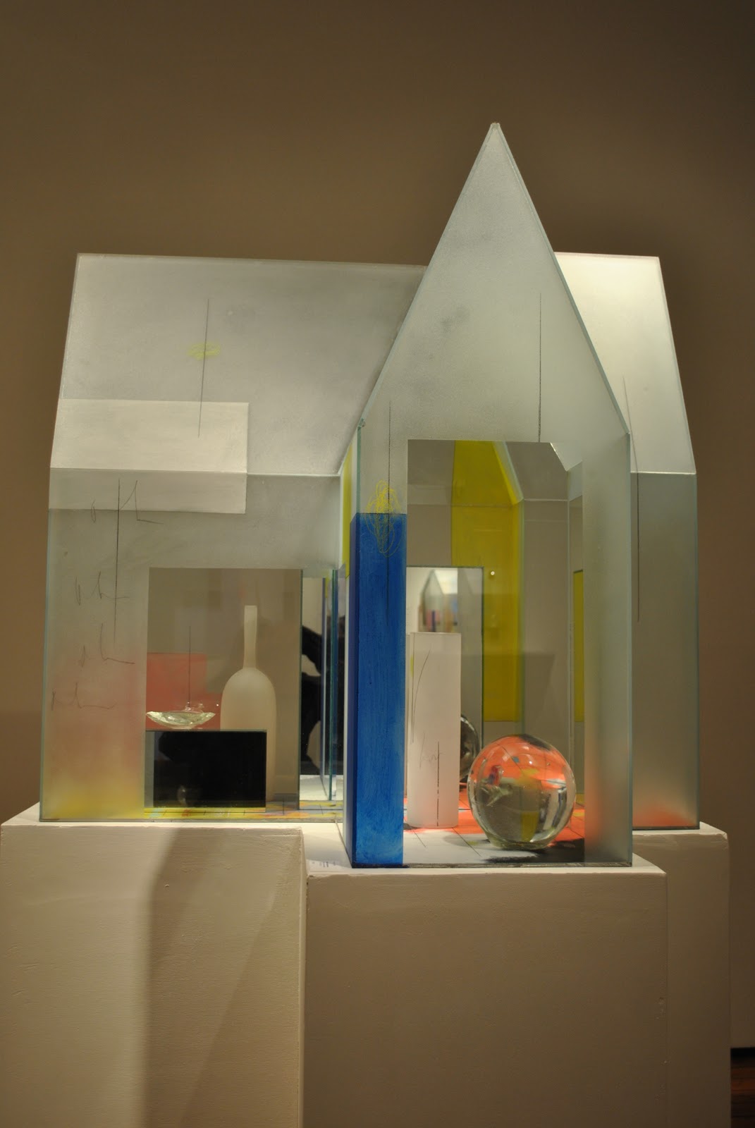
Of the two artists I looked at this month, Therman Statom is in more danger of falling into this trap. The work he had on display feels as if it is fully actualized, but I have trouble seeing where else it can possibly go. And this concern in underscored by the fact that there are several pieces in the show that seem to be ineffective tangents off of the main idea, as useless as the extra impractical limbs grown by a species that’s hit an evolutionary wall.
Several of Statom’s pieces are glass house structures, which by themselves are very interesting forms. They are large enough that the viewer can move around them and get a full experience from all angles, and there is an added incentive to do so since parts of the walls are see through. The reflections of the glass create a dynamic space out of the hard-lined geometric dwellings, and provide a multi-layered environment to explore.
Within the structures are different objects, mostly made of glass. These tend to be rather bland objects – glass spheres and bottles, etc. – and the house structures would probably be better off empty than with these cliché objects in them. By themselves the forms of the houses are something that people can relate to, and they create compelling enough spaces that they invite exploration. It would almost be better to remove anything that would distract the viewer from analyzing the structure before them and what it means that it was created in this way. Viewing the houses themselves could raise the following question in the viewers head: how is it that we feel a connection to this geometric form that is made from a cold, hard, uninviting material? Or at least if their thoughts don’t delve so introspectively the viewer can at least appreciate the form of the house as it is. They are fairly unique and clearly well-made. By themselves they are interesting enough to be remembered and possibly dwelled upon in the future.

There are several different objects placed inside these houses, none of which enhances the piece very well, and the most frequent object used is the cliché glass sphere. These spheres are very attention-grabbing because they are so different from the angular space that contains them, and distract the viewer’s eyes from looking at the interesting glass forms to something that is more strongly associated with a museum gift shop. The house forms have a very obvious manufactured feel to them, but they are such uniquely shaped structures that the artist’s hand still lends them a touch of personality. The spheres on the other hand are generic forms with less character than a bowling ball.

Statom’s work has obviously come a long way. His pieces look too refined for him to have started making these things recently. But it feels like he didn’t know where else to go with a good idea and started sticking crud in them just to change things up a bit. There is also a very gaudy 5 foot tall ladder form with random glass objects stuck all over it that doesn’t fit anything else that is going on in the show. It’s as if he decided that he was accomplished enough that he didn’t have to try to impress the viewer anymore, and that any glass thing he turned out would be received without complaint. Well I feel the need to say something about it, because it’s generic pieces of art like this that end up getting bought by corporations because they’re safe, something that could never truly offend anybody’s taste, and that’s what gets displayed to the public as the current state of contemporary art. It’s a piece of junk that says nothing to anybody, and even worse, it detracts from the highlights of what could be a really good gallery show.
One of my favorite things about the show is the reference to Mondrian’s paintings in the work. In the large painting on the wall, large rectangles of primary colors have been worked into the composition and directly reference the work of the modernist painter. These same rectangles are also seen repeated in the other glass structures of the show. Yellow and blue rectangles worked into the house structures mirror what is happening in the larger piece on the wall which creates a strong sense of unity between the pieces, and also adds to the idea that the work is analyzing the human environment in the modern age. The show would be much stronger if it worked to push the use of these devices further and Statom returned all his glass spheres to the museum gift shop he bought them from.
Kent Michael Smith
Kent Michael Smith has figured out a very sharp aesthetic for his work. By pouring several layers of a clear gloss resin over a panel he makes some abstract pieces of incredible depth that are far beyond what could be achieved without this method. The core of his pieces focuses on brightly-colored arrangements of abstract shapes that appear to be inspired by graffiti. Ordinarily it would be hard to see these compositions as anything but a typographer’s doodles, but the process through which they are created puts these shapes in a context that infuses them with much more vitality.

A closer look shows that the shapes themselves are not a single mass but several layered images built on top of each other, and although the space between layers is not drastic it is enough to give a sense of movement and life to the abstraction. It feels as if it was grown rather than drawn, and leads the viewer into thinking more about the creative process in general than getting stuck on what is seen immediately in front of them.
The show is a bit monotonous in that all the pieces are essentially the same thing executed with different variations, but they are interesting enough to explore that it’s not a distraction. It’s also impressive that Smith is able to incorporate typically untouchable elements like glitter into the pieces and make it work seamlessly. In any other type of work a glitter effect would be just gaudy, but the high-gloss effect of the work masks the glitter and it blends in among the rest of the thin washes and bright blocks of color, which themselves could be unbearable in other circumstances.

Everything in Smith’s presentation works together, making for a nice show. I just hope that he doesn’t become too afraid to change what he’s doing in his future pieces, because as of now the work is good, but it would be real disappointing to see a Kent Michael Smith show next year of similar work. It’s never a good idea to continue playing off the same artistic formula over and over, but it could get old particularly quick in this kind of work that is held together only by the method through which it is made. If that happens, there won’t be enough clear gloss resin in the world to tone down those streaks of glitter.
Erica Mahinay at Arts Incubator
The still life is one of the oldest conventions in art, and painter Erica Mahinay has come up with a way of making it relevant again. Instead of painting on a canvas, Mahinay uses pieces of frosted plexi-glass as her surface, which gives her some interesting options to work with. In “Still life with pears” what would ordinarily be a dull painting of some fruit is instead embellished by leaving portions of the plexi-glass unpainted to reveal several ceramic pear cores behind the actual painting. It wouldn’t necessarily have to be pear cores found behind the piece for this effect to work well, simply breaking up the space using this method is enough to keep the piece from being just another still life.

Mahinay also has several of the ceramic pieces suspended on the outside of the piece from wires. If this were done on a traditional painting without the added transparent background it would probably look very silly, and maybe even cliché in a strange way, but with the addition of space behind the piece these frontal objects do not look out of place. In this show the actual paintings become the middle ground between objects placed in front of and behind the picture plane, and these spatial relationships complete the work with nice visual and conceptual depth. When we see the painting sandwiched between these two additional planes, we can begin to see the scene as a snapshot in time, with the objects representing a possible before and after of that scene, or at least something from the painting in a different state of being, which is more compelling than looking at fruit on a table.

But of the two effects, incorporating objects on top of the piece and objects that can be seen behind the piece, I prefer the latter. Having objects emerge within the image is a very effective way of enhancing the painted image without running the risk of overdoing it. No matter what you see through the glass, it is still contained within the image and feels as if it is a solid component of it. But adding objects on to the exterior of the piece must be done delicately, and I’m tempted to say that Mahinay gets a little careless in doing this sometimes.
Where this effort doesn’t work well is when the added objects don’t feel well incorporated with the rest of the work. One example is a painting of a dining room table that is split down the middle by a bundle of large hair braids. The image itself is very good, with the table sitting over a pile of turkey bones that appear underneath the plexi-glass and eventually emerge on the outer surface of the painting. This effect works well with the painted image and doesn’t come off as overbearing, but then the braids almost become too strong of an element and distract from the rest of the piece.
I think the real problem with the braids in this case is that they don’t feel grounded. They hang suspended just above the top of the piece on a small stick, then drape down the rift between the two panels, then fall to the floor in a pile below. Where are these braids coming from, and where are they going? What is their purpose and means of existence? Our brains can make sense of the braids when they are within the picture plane because even though they are very different from the rest of the piece, they feel contained and incorporated into that context. But having them run through the piece and hang out leaves, excuse the pun here, too many loose ends to deal with.

If the braids were coming out of the wall, or coming out of a box or other object, or stayed contained within the picture plane, then they would feel like an integrated component of a larger piece. But as they are they feel incomplete and tacked on, as if Mahinay had an idea for their inclusion in the overall piece but didn’t finish working out the details and left the piece as is for the show. Another of her pieces that has a jumble of furniture parts piled below it suffers from the same problem of not feeling completely resolved.

But one example where Mahinay lets loose with the sculptural elements and does it well is in the largest piece in the show. This work features a painting of packing peanuts, moving boxes, and sheets. It has real packing peanuts seen behind portions of the glass with ceramic packing peanuts fixed on the outside. This piece is also split by an object, this time a white sheet, but it works much better than the piece with the hair braids because the added object feels completed by being part of a larger network of objects. In this case the sheet is suspended by twine from a frame higher up on the wall, making a complete circuit that passes through the main portion of the piece.
It is also visually and conceptually better linked to the work by continuing elements found in the piece beyond the rectangular boundary. The sheet is filled with the ceramic packing peanut forms, and through it are also strung two teacups like the ones painted into the image. Unlike the braided hair piece, this work feels like a well-rounded effort at pushing the piece to a new level rather than introducing a three-dimensional element just for the sake of adding something three-dimensional.

Mahinay exhibits some ingenuity in this show. It takes some mettle to even attempt making work like this, and I hope she continues to work with and refine the same ideas. She has established an interesting aesthetic that draws from older and slightly ornate room interiors, changes throughout time, and food. While it’s not entirely clear what is meant through these references, it’s also not that important so long as the pieces work visually. But perhaps Mahinay would be able to enhance her work by pushing it in a direction where her unusual methods become a means of saying something more specific about the themes she’s working with.
Unknown at the Next Space Gallery – BEST IN SHOW
 This is a little unusual, but I don’t know the name of the artist responsible for my favorite show of this First Friday. Next Space Gallery is an oddball little space just inside the pale on the far end of 18th Street, right after the Slap and Tickle Gallery and right before you start wandering through the abandoned industrial landscape by the highway. I’ve passed by Next Space before, and it seems to be a place that attracts an “outsider art” crowd, or people who love and make art but have never formally studied it. Work by artists like this can be exciting to see because they are so unrestricted in what they do. They are not trying to impress anyone or live up to anyone else’s standards. They are making the work they want to make, and there is a real purity to that. And this particular time I felt compelled to go in and check out what they had based on the incredibly large and intricate drawing I could see through the front window.
 |
| A close detail shot of the above piece |
Next Space Gallery is a gallery only in name. It’s really a small, dark little building with no easily distinguishable purpose. On entering there are passages that go to the right and to the left. To the left was a large room that was apparently not in use, but among the chairs and other items stored in there were several strange drawings on the wall. The only one I remember in specific looked to be a morbid marker drawing involving Ronald McDonald. So maybe this room was part of the show and they just forgot to turn the lights on? I decided not to mess with it and headed back to the other side with the drawing that caught my attention in the first place.

It is a very dense colored pencil drawing that from a distance looks like it could be a very detailed illustration of London in the 1800’s, with soft curves of similar-sized squares and rectangles packing the 4’x4’ panel in soft muted color tones. Then up close it is seen that the whole piece was made of abstract shapes mimicking letters, each being about ½ an inch square. Each shape is individually outlined and colored with great detail, and the composition is dense enough that it is likely that these symbols were actually used to conceal further drawing underneath. It would take an unimaginable amount of time to complete this piece. And there is such a strong sense of order and consistency to the symbols in the drawing and the patterns which they follow that the whole piece was obsessively labored over by the artist. It is a solid expression of an idea or state of being that I could never achieve or understand myself, and that is what makes this piece truly great.
 |
| An extreme closeup look at the piece shown above |
Along the same lines is a piece in the back, but instead of being made of symbols the large panel is a rich tapestry of small lines. Up close this drawing also reveals the same obsessiveness and care in creating the pattern. The marks have the feel of being made fairly randomly, but studying the consistency of the marks reveals that they are actually made with quick precision.
There are the only two other pieces in the show that boast these engrossing “all-over” style compositions, which is understandable because that would probably limit the artist to putting on a show every ten years or so. The rest of the works on display covered a wide variety of subjects and styles, but they were all great to look at because they each employ some very unusual method of making the image that is executed with perfect precision. In a set of paintings labeled “Mike Enike” a simple trick of brushing thin white acrylic so that the paint bunches at the edges is used perfectly to create an illusion of a shape similar to that of Mike and Ike candies. It is simple, but it is done so well and with such precision that it creates a truly dynamic result in the piece.

I only declare whoever put this show together as an “outsider” artist based on the off-beat nature of the space it was shown in, the lack of style and subject continuity through the pieces, and how unconventional the work is. If this person received any training as an artists, then they are an incredible genius because they were able to shed any trace of indoctrination or conventionality they may have received. What makes this show so good is its gritty purity. It is actually art for the sake of art, and there is a humble genius in how far the simple ideas that provide the basis for these works is taken.


